
I’ve made an autumn junk journal before, all warm oranges and pressed leaves, and I loved it. But somewhere around the start of October I always find myself wanting something a bit more specific: a journal that says “Halloween” the second you open it, not just “cosy season.” This is my attempt at building exactly that, page by page, alongside you.
To be clear up front, this isn’t a gothic or genuinely spooky journal. Think black cats and moon phases rather than anything unsettling. If you want the full seasonal walkthrough with pumpkins, foliage, and general autumn pages, my Autumn Junk Journal walkthrough covers that ground already. This one is narrower on purpose.
If you’ve made a journal with me before, you probably already have most of what you need tucked in a drawer somewhere: kraft paper offcuts, a few stray ribbons, maybe some old book pages. This isn’t a project that needs a fresh supply haul, it’s more about looking at familiar materials through a Halloween-specific lens.

Crafting Her Plans
Ready to plan it all out? We’ve got you.
Head over to the shop for printable planners and journals you can download and start using today.
Browse the shop →🦇 What Actually Makes a Journal Read as “Halloween”
It’s easy to assume any orange-and-brown page counts as Halloween, but that’s really just autumn. The difference comes down to two things: palette and motifs.
For palette, think black, deep purple, and pumpkin orange against kraft brown, rather than the warm golds and rust tones of a general fall spread. For motifs, swap pumpkins and foliage for bats, crescent moons, potion bottles, and black cats.
Once you start looking for it, this distinction is everywhere in Halloween-specific journals: the colours are a little moodier, and the little illustrated details point specifically at Halloween rather than “any autumn evening.”
Texture helps too. A little vellum or tissue paper laid over a page gives a soft, slightly ghostly look, and it pairs nicely with a vintage-style postcard or two if you have any tucked away. None of this needs to be exact, it’s more a feeling you’re building toward across the whole journal than a strict checklist.
🕯️ Gathering Your Halloween Palette
Before starting any pages, it helps to gather a small pile of materials that already lean Halloween rather than generic fall. Kraft paper is doing a lot of work here since it takes ink and stamps beautifully and reads as slightly aged without any extra effort.
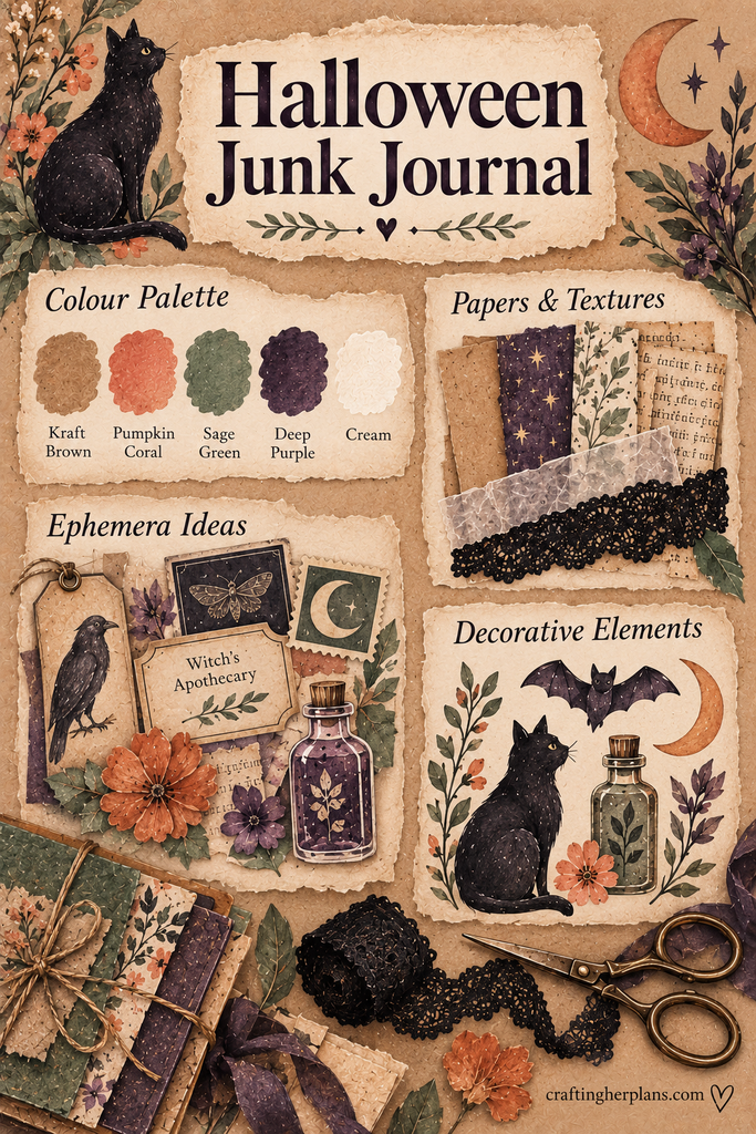
Black lace, either as scraps or ribbon offcuts, adds texture without needing to buy anything specialised. Vintage-style apothecary labels (plain kraft or cream labels you print or hand-letter yourself work just as well as anything bought) are the other key ingredient, since they show up again and again in the potion-label spread below.
If you’re starting from nothing, my guide to what you actually need to get started with junk journaling covers the basics, and where to find ephemera without spending a fortune is worth a look before buying anything new for this specific palette.
📖 Page One: A Cover That Sets the Mood
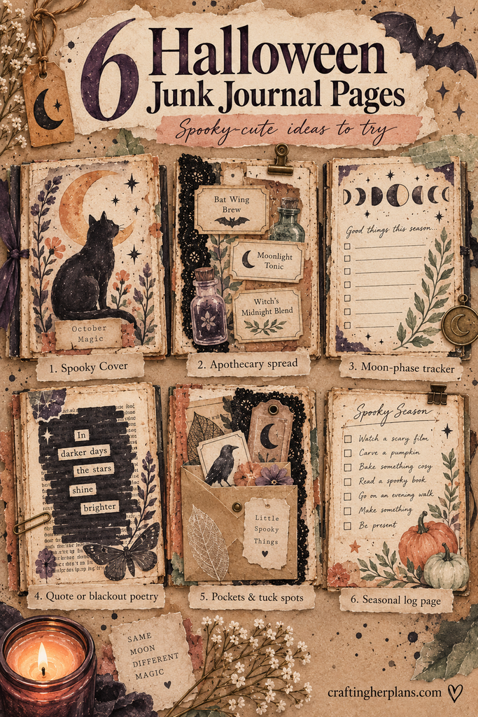
The cover is where you decide how spooky-cute this journal is going to be, so it’s worth spending a bit of extra time here. A simple approach: a kraft paper base, a black cat silhouette cut from black cardstock, and a moon shape layered slightly behind it.
Add your title in a slightly uneven, hand-lettered style rather than anything too neat. It should feel a little playful, like a kid’s storybook version of spooky rather than anything genuinely eerie.
🧪 Page Two: An Apothecary or Potion-Label Spread
This is one of my favourite pages to make, and it’s simpler than it looks. Take a handful of small envelopes, jam jars cut from magazine pages, or even simple rectangle shapes, and label each one with a playful “potion” name (Bat Wing Brew, Moonlight Tonic, Witch’s Midnight Blend).
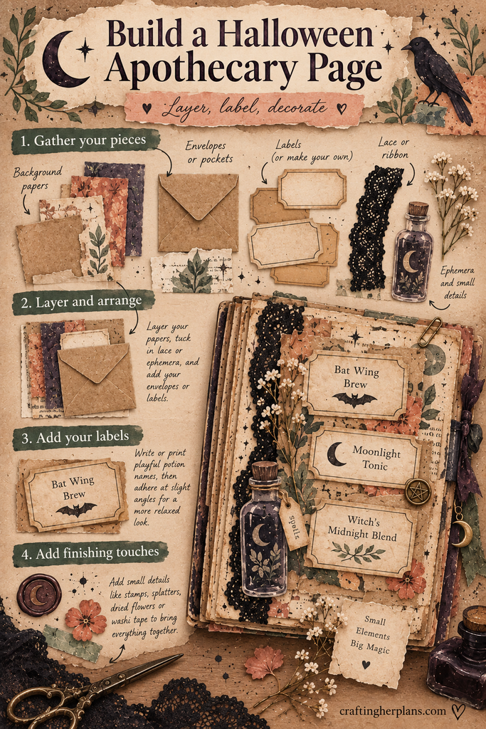
Layer a few of these labels across the page at slightly different angles, with a bit of black lace or ribbon tucked underneath for texture. Distressed, kraft-coloured labels sell the apothecary feel far better than anything too clean or modern-looking.
🌙 Page Three: A Moon-Phase Tracker
A moon-phase page is a nice one to include because it does double duty: it’s decorative, and it’s genuinely something you can use through the rest of the season. Draw or stamp a simple row of moon phases across the top of the page, then leave space underneath for notes on each night, an evening walk, a spooky film watched, a bit of pumpkin carving.
Keep the moons in a limited palette (cream circles with black or deep purple shading) so the page feels intentional rather than busy.
🖤 Page Four: A Spooky Quote or Blackout Poetry Page
If you enjoy the more reflective side of journaling, this page is for that. Take an old book page, magazine clipping, or printed text, and either write a favourite spooky-season quote directly onto it, or black out most of the words with a marker to leave a short poem behind, sometimes called blackout poetry.
This is a good spot to lean a little more atmospheric with your materials: deeper purples, a torn edge or two, maybe a single pressed leaf tucked into the corner.
🎃 Page Five: A Pocket or Envelope Page for Trinkets
Every journal benefits from at least one page that holds something rather than just showing something, and Halloween trinkets are easy to come by this time of year. A simple envelope glued to the page, or a pocket folded from kraft paper, gives you somewhere to tuck a Halloween sticker sheet, a small paper bat, or a ticket stub from a pumpkin patch trip.
It’s also a nice spot for anything you don’t quite know what to do with yet: a scrap of black lace, a spare apothecary label, a small dried flower. Future you will be glad it has a home.
🎬 Bonus Page: A Halloween Movie Night Log
If five pages doesn’t feel like enough, this one is an easy addition. Set aside a page for logging Halloween films watched through the month, with a small box beside each title to jot a quick rating or favourite line.
Tuck in a cinema ticket stub if you have one, or a little hand-drawn popcorn box in the corner for decoration. It’s a nice low-effort page to add to over several evenings rather than finishing in one sitting, and it gives the journal a lived-in feel by the time Halloween actually arrives.
🧰 Quick Supplies Checklist
Before you start, it helps to have these within reach. None of it needs to be new or specialised:
- Kraft paper and a few sheets of black or deep purple cardstock
- Black lace or ribbon scraps
- Old book pages or magazine clippings
- A black or brown ink pad for distressing edges
- Small envelopes or scraps for pockets
- Scissors, ideally a pair with a scalloped or deckle edge for the torn-look labels below
✂️ Getting the Spooky-Cute Look: Simple Techniques
None of the techniques above need to be complicated, and a few small habits go a long way toward the finished look. Ink distressing (rubbing a little brown or black ink along paper edges) instantly ages kraft paper and labels without any extra materials.
Layering matters more than any single technique. Overlapping two or three elements, a label over lace, a moon over a torn strip of paper, gives pages depth even when each individual piece is simple.
Torn and scalloped edges also do a lot of visual work here, especially on labels and pocket flaps. A pair of deckle-edge craft scissors makes this fast and consistent if you’re doing it across a whole spread, though tearing paper by hand against a ruler works nearly as well if you’d rather not buy anything new.
One small habit that pulls a whole spread together: pick a single accent colour, purple or orange usually works best, and repeat it in at least two or three spots on the page. A purple ribbon, a purple-inked stamp, and a purple label all on one page reads as intentional even if everything else on it is a bit mismatched.
How This Differs From My Autumn Junk Journal
If you’ve already read through my general Autumn Junk Journal walkthrough, you’ll notice this one deliberately avoids repeating those pages. There’s no foliage spread, no general “cosy season” cover, and no pumpkin-spice-adjacent colour palette here.
Everything in this journal points specifically at Halloween: the moon tracker, the potion labels, the black cat cover. If you want both, I’d treat them as two small, separate journals rather than combining them into one, since the palettes and moods genuinely don’t overlap much.
One honest gap: I don’t currently have a printable insert version of these pages in the shop, so for now this is very much a “gather your own materials and build it yourself” walkthrough rather than a print-and-go kit. If that changes, I’ll come back and link it here.
I’d also rather you take these six pages as a starting list than a fixed plan. If the potion-label spread turns into your favourite page and you end up making three of them instead of one, that’s a better outcome than sticking rigidly to five pages because a blog post said so. The whole point of a journal like this is that it ends up looking like yours, not like a template.


