There’s no shortage of styles of planner layouts for days, weeks, and months. But I often found that I wanted something a little in the middle. Then I found the planner dashboard layout in the Happy Planner and I was set. But what is it, and how might it work for you?
What is a dashboard layout?
The dashboard layout is a little bit of a hybrid planner layout. It is a two-page spread that has the calendar and one side and a range of multi-purpose boxes on the other. We’ll use the Happy Planner version in the Classic size as the example, as this is the one I’ve been using.

The left-hand page is the all-sorts area. The default boxes include:

Crafting Her Plans
Ready to plan it all out? We’ve got you.
Head over to the shop for printable planners and journals you can download and start using today.
Browse the shop →- Shaded area for errands (or jobs)
- A To Buy list with coloured checkboxes
- Blank Call/Emails section
- Blanks Bills to Pay section
- Grid-lined Focus section (often with a little quote or graphic to the far side)
The other side of the page is the week’s calendar. It is actually divided into eight areas, with the first one being a small menu planner for the week’s dinner menu. Then there’s a box for each day of the week with six lines inside it.
What’s to love about it?
For me, I love being able to have a lot of information for different things in one view. Particularly the stuff that isn’t date specific.
This side of the layout page is ideal for planning all the things to do in a week without always adding them to the calendar. So if there are jobs that aren’t tied to a specific date, then could go in the errands section. Or maybe you need to buy something on the next food shop but don’t know when that is.
The mini-menu planner is a fun addition but you could overlay the title and make it into something else if you wanted. It could be an activities area if the kids have things happening each week on a set date. Or business tasks you want to remember to do on specific days but keep off your calendar.
What might not work for you?
Now I’m not saying that eh dashboard layout would work for everyone. For me, the biggest issue would be people with lots of things happening every day.
If you need more than six lines to record events for the day, then this layout might not be the one for you. A traditional week across two pages might be a better spread. Of course, you could always do both and use the dashboard for highlights and add a fuller week spread after it for those more detailed plans.
Planner dashboard layout examples
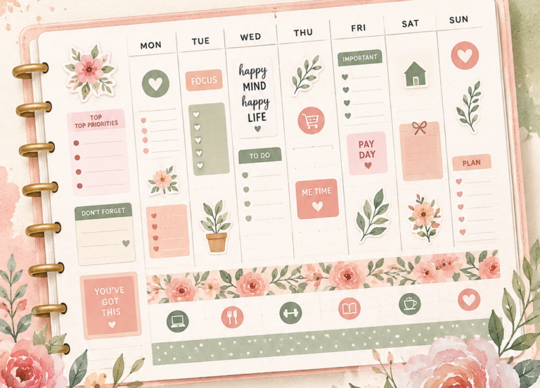
For the non-calendar area, you can use as much of what’s provided or completely cover it with stickers to make it look as different as you want. Here’s a great monochrome example where most of the page is made into something different from the original list format.
Or you can just use stickers and washi tape to add to the planner, make it more yours but leave the basic format as it is. With this one, there are a few accent stickers overlaying areas that are not needed that really make the layout look even more interesting.
Finally, this one makes use of some of the sections, overlays some of the titles to make them into something they need, and also uses gorgeous stickers to cover areas they don’t.
A great planner layout
For me, the planner dashboard layout is one of my favourites. It is multi-purpose and easy to use as I don’t have a lot of need for lots of slots per day. And it is easy to adapt with the use of stickers and other planner accessories so that you can have a layout that works just as you need it.
You might also like Bullet Journal To Do Lists for All Your Everyday Tasks by Crafting Her Plans